Additional CSS examples
In this guide, we will demonstrate how easy it is to customize various aspects of your form using CSS. Whether you want to change fonts, adjust text colors, modify backgrounds, or style individual elements, these examples provide a clear path to enhancing the look and feel of your forms.
If you need help finding the Custom Code option in Reform, please refer to this doc
Simple Customization Examples
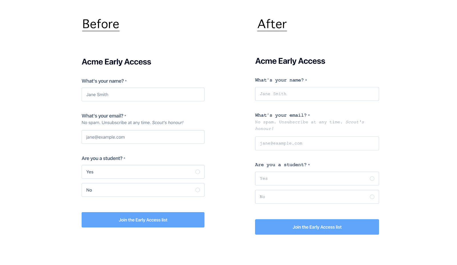
- Changing Font for All Fields
Use Case: Change the font style for all form fields.
This customization allows you to apply a specific font style to all form fields, ensuring that text appears in a font that aligns with your brand.
Example:
.block-name, .block-email, .block-select-one {
font-family: 'Courier New', Courier, monospace;
}
How the form looks after applying the CSS:
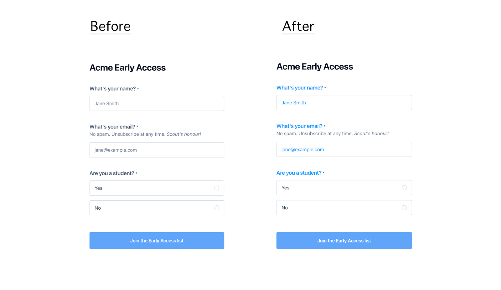
- Changing Copy Color for All Fields
Use Case: Change the text color for labels and input placeholders in all form fields.
This customization is particularly useful when you want to make sure that form text, including labels and placeholders, is easily readable against your chosen background colors.
Example:
.block-name label, .block-email label, .block-select-one label,
.block-name input::placeholder, .block-email input::placeholder {
color: #0096FF;
}
How the form looks after applying the CSS:
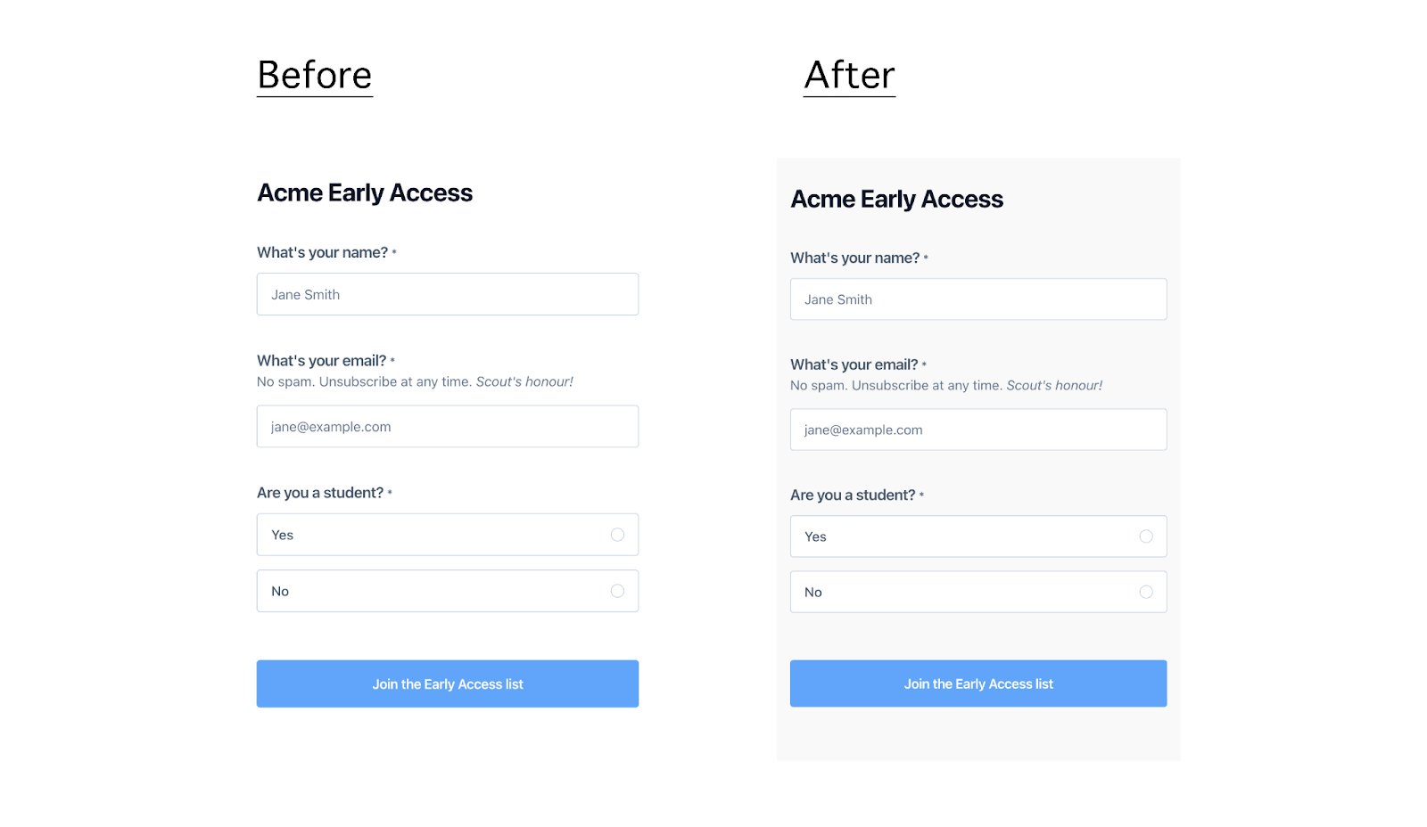
Changing Form Background
Use Case: Change the background color of the entire form.
Applying a custom background color helps to visually separate the form from the rest of the page content, drawing attention to it and improving the overall user experience.
Example:
.form-container {
background-color: #f9f9f9;
}
How the form looks after applying the CSS:
- Displaying Two Fields on the Same Row
Use Case: Display the first name and last name fields side by side in the form.
By positioning fields side by side, you can create a more organized and user-friendly layout, which can help users fill out the form more quickly and efficiently.
Example:
.block-name {
display: inline-block;
width: calc(50% - 0.56rem);
}
.block-name:nth-child(3) {
margin-left: 1rem;
}
How the form looks after applying the CSS:

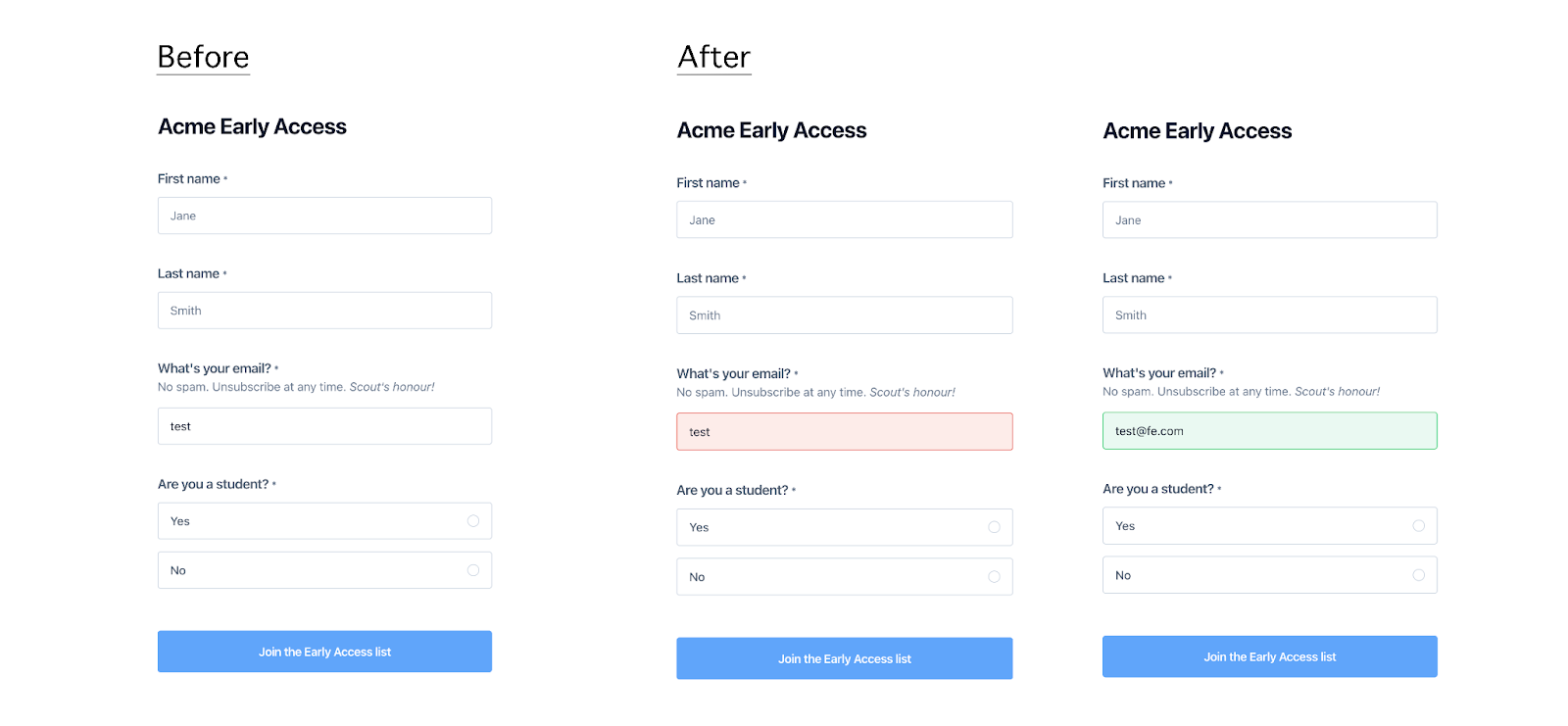
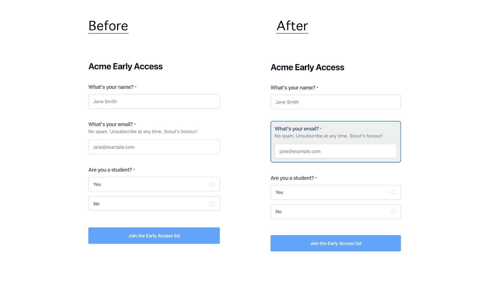
- Styling Еmail Field Based On Validation State
Use Case: Style the email input field to provide visual feedback for valid and invalid email entries.
Visual feedback is crucial for user interaction, as it guides the user in real-time, enhancing the overall form experience by making it clear when an email address is correctly formatted or needs correction.
Example:
.block-email input[type="email"]:valid:focus,
.block-email input[type="email"]:valid:not(:placeholder-shown) {
border-color: #2ecc71;
background-color: #eafaf1;
}
.block-email input[type="email"]:invalid:focus,
.block-email input[type="email"]:invalid:not(:placeholder-shown) {
border-color: #e74c3c;
background-color: #fdecea;
}
How the form looks after applying the CSS:
Advanced Customization Examples:
- Customizing a Single Element
Use Case: Customize the appearance of a single form element (e.g., email field).
Example:
.block-email {
padding: 12px;
border: 2px solid #2980b9;
border-radius: 8px;
font-size: 16px;
background-color: #ecf0f1;
}
How the form looks after applying the CSS:
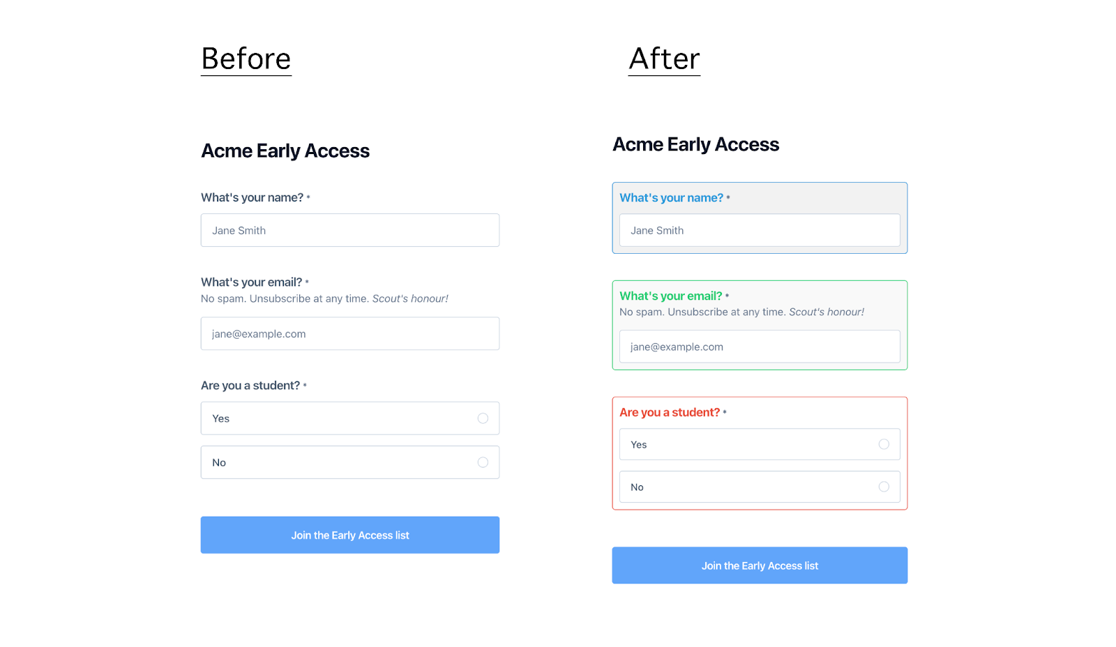
- Customizing Several Elements
Use Case: Customize the appearance of several form elements (e.g., name, email, and single-select fields).
Example:
/* Customize the name field */
.block-name {
padding: 10px;
border: 1px solid #3498db;
border-radius: 5px;
background-color: #f2f2f2;
font-size: 15px;
}
.block-name label {
font-weight: bold;
color: #3498db;
}

/* Customize the email field */
.block-email {
padding: 10px;
border: 1px solid #2ecc71;
border-radius: 5px;
background-color: #f9f9f9;
font-size: 15px;
}
.block-email::placeholder {
color: #95a5a6;
font-style: italic;
}
.block-email label {
font-weight: bold;
color: #2ecc71;
}

/* Customize the single-select field */
.block-select-one {
padding: 10px;
border: 1px solid #e74c3c;
border-radius: 5px;
background-color: #ffffff;
font-size: 15px;
}
.block-select-one select {
width: 100%;
padding: 8px;
border: none;
border-radius: 5px;
background-color: #ecf0f1;
}
.block-select-one label {
font-weight: bold;
color: #e74c3c;
}
.block-select-one select:focus {
border: 1px solid #e74c3c;
outline: none;
}
How the form looks after applying the CSS:
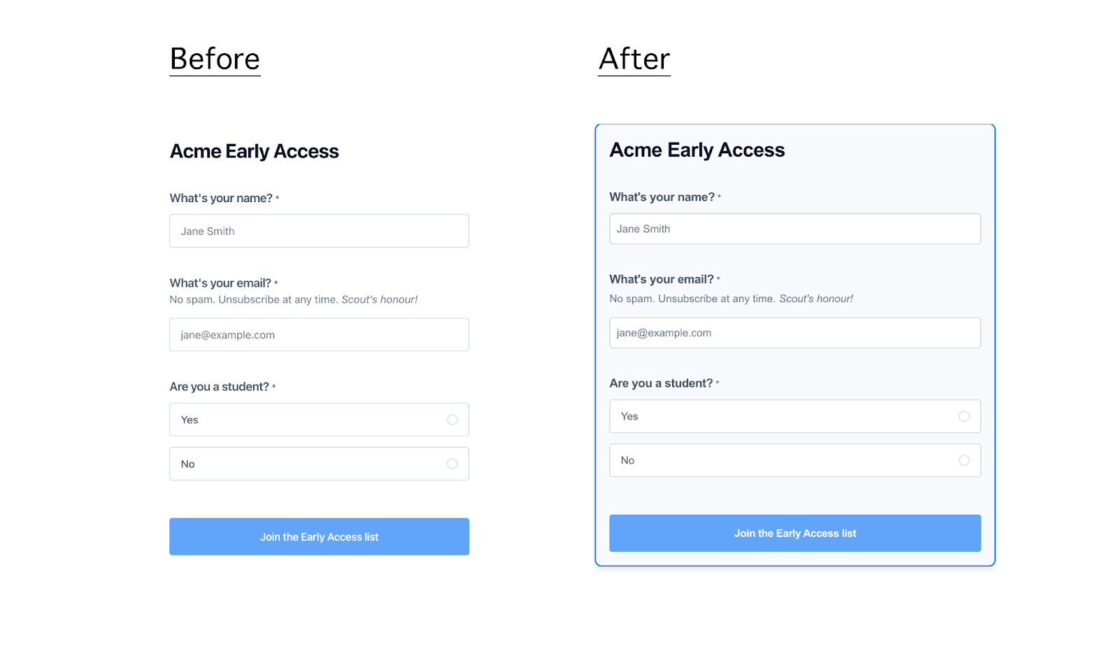
- Customizing the Whole Form
Use Case: Apply a uniform style to the entire form, including borders, background color, font, and shadows.
Example:
/* Customize the entire form */
.form-container {
border: 2px solid #007bff;
background-color: #f7f9fc;
padding: 20px;
border-radius: 10px;
box-shadow: 0 4px 8px rgba(0, 0, 0, 0.1);
font-family: 'Arial', sans-serif;
max-width: 600px;
margin: 0 auto;
}

/* Customize the name field */
.block-name {
margin-bottom: 15px;
}
.block-name input {
padding: 10px;
border: 1px solid #ccc;
border-radius: 5px;
width: 100%;
box-sizing: border-box;
}
.block-name label {
font-weight: bold;
margin-bottom: 5px;
display: block;
}

/* Customize the email field */
.block-email {
margin-bottom: 15px;
}
.block-email input {
padding: 10px;
border: 1px solid #ccc;
border-radius: 5px;
width: 100%;
box-sizing: border-box;
}
.block-email label {
font-weight: bold;
margin-bottom: 5px;
display: block;
}
.block-email::placeholder {
color: #999;
font-style: italic;
}

/* Customize the single-select field */
.block-select-one {
margin-bottom: 15px;
}
.block-select-one select {
padding: 10px;
border: 1px solid #ccc;
border-radius: 5px;
width: 100%;
box-sizing: border-box;
}
.block-select-one label {
font-weight: bold;
margin-bottom: 5px;
display: block;
}
.block-select-one select:focus {
border-color: #007bff;
outline: none;
}
How the form looks after applying the CSS:
Click here to see the form in action.
Best Practices and Final Tips
- Cross-Browser Compatibility: Always test your customized forms across different browsers to ensure they render correctly and consistently. Different browsers may interpret CSS slightly differently, so testing is crucial to avoid unexpected issues.
- Accessibility: Make sure your customizations do not negatively impact accessibility. For example, ensure sufficient color contrast for text and interactive elements, and use clear, readable fonts.
- Performance Considerations: Keep your CSS lean and efficient to avoid slowing down form load times. Overly complex or redundant CSS can negatively impact performance, especially on mobile devices.
- User Feedback: Use CSS to enhance user feedback, such as changing the appearance of fields when they are focused or when validation errors occur. This real-time feedback can greatly improve the user experience.
By leveraging these customization options, you can create forms that align perfectly with your brand identity and user experience goals. Feel empowered to experiment further with CSS properties to achieve the exact design you envision for your forms.
If you're experiencing issues or have questions, please contact us at [email protected]. We're here to assist you!