Custom CSS: How to style your forms
(Pro Plan Only)
You can use custom CSS to fully control the appearance of your Reform forms, from basic font changes to advanced, responsive layouts. This guide walks you through how to add CSS, target specific elements, and apply real-world style examples.
Jump into practical examples below, or follow the steps below
Getting Started
-
Where to Add CSS
- Go to your form's Code tab.
- Click on the CSS option (next to Form Events and Parent Page Events).
- Write your custom CSS in the provided editor.
- Preview your changes live, and save when you're satisfied.
-


Targeting Specific Elements
To make it easier, we've provided selectors for targeting different types of elements on your form. You can target individual pages, blocks, or block types using selectors.
1. Targeting Specific Pages
- Using Page Selectors:
To target elements on a specific page, use the page selectors.
- Example: To target the thank you page, use the following code:
/* Targets the thank you page */
#page-thank-you {}
- Example: To target a specific page, use the following code:
/* Targets a specific page */
#page-4f1ba767-7805-4a81-a408-66fcc89d1da3 {}
- To find a specific page ID, click on the 'Page Settings' button in the form builder and select 'Copy ID'.

2. Target Specific Block Types
- To target specific block types, you need to use block type selectors. Each block type (like Email, Dropdown, Heading) has a class you can use.
- You can find a list of all block type selectors here.
Example: To target all Heading 1 blocks, use the following code:
/* Heading 1 blocks */
.block-heading-1 {}
3. Target Specific Blocks
- Use block IDs for exact targeting:
Example: To target a specific block, use the following code:
#block-d1660739-2218-4335-b841-0e1ce4039af5 {}
- To find a specific block ID, click on the gear icon next to a block in the form builder and select 'Copy ID'.

Common Customization Examples
Once you have decided which page or specific block you want to target, write the CSS code to apply the desired changes. Here are some examples:
- Changing the Text Color of Heading 1 Blocks
.block-heading-1 {color: #ff0000;}
This will change the text color of all Heading 1 blocks to red.
- Changing the Background Color of a Specific Block
#block-d1660739-2218-4335-b841-0e1ce4039af5 {background-color: #00ff00;}
This will change the background color of the block with ID d1660739-2218-4335-b841-0e1ce4039af5 to green.
- Centering Text on the Thank You Page
#page-thank-you {text-align: center;}
This will center-align all text on the thank you page.
- Creating a Block with Rounded Corners and a Gradient Background
.block-select-multiple {
border-radius: 12px;
background: linear-gradient(45deg, #ff6b6b, #f06595);
color: #fff;
padding: 10px 20px;
border: none;
cursor: pointer;
}
- This code creates a select multiple block with a 12-pixel radius, a diagonal gradient background, white text, and no border.
5. Adding a Drop Shadow to a Form Container
.form-container {
box-shadow: 0 4px 8px rgba(0, 0, 0, 0.1);
padding: 20px;
background-color: #fff;
}
- This code adds a subtle shadow effect around the form container to give it a lifted appearance.
6. Customizing Placeholder Text in Input Fields
.block-email ::placeholder {
color: #999;
font-style: italic;
}
- This code makes the placeholder text in email blocks light grey and italic.
7. Hide Checkboxes
.block-select-multiple.checkboxes .theme-check {
display: none;
}
8. Hide Radio Circles
.theme-radio {
    display: none;
}
9. Disable Submit Button Until Checkbox is Selected
/* disable button design /


/ Root variables for the disable button design /
:root {
--disabled-bg: linear-gradient(139deg, #d2d2d2, #d2d2d2);
--enabled-bg: linear-gradient(139deg, #2ca070, #48cb94);
}


/ This dynamic class is attached from JS to the button to apply a disabled button design.
Change the class name according to your project /
.buttonDisabled {
pointer-events: none;
cursor: not-allowed !important;
background-image: var(--disabled-bg) !important;
}
/ disable continue button /
.form-container:has(div:not([role="checkbox"][aria-checked="true"])) .block-submit[type="submit"] {
pointer-events: none;
cursor: not-allowed;
background-image: var(--disabled-bg);
}
/ enable continue button */
.form-container:has([role="checkbox"][aria-checked="true"]) .block-submit[type="submit"] {
pointer-events: auto !important;
cursor: pointer !important;
background-image: var(--enabled-bg) !important;
}
Additional Customization Examples
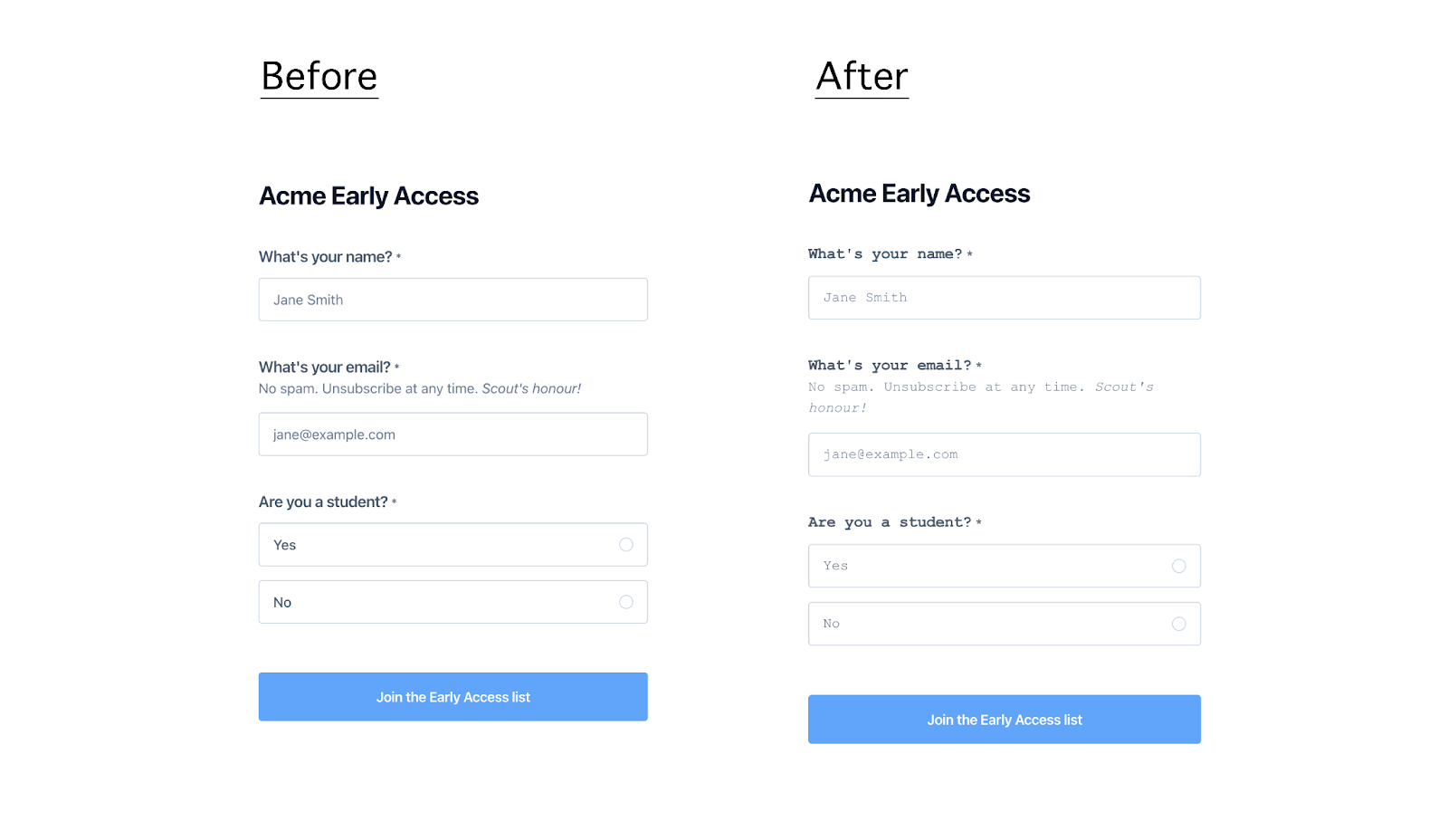
- Changing Font for All Fields
Use Case: Change the font style for all form fields.
This customization allows you to apply a specific font style to all form fields, ensuring that text appears in a font that aligns with your brand.
Example:
.block-name, .block-email, .block-select-one {
font-family: 'Courier New', Courier, monospace;
}
How the form looks after applying the CSS:
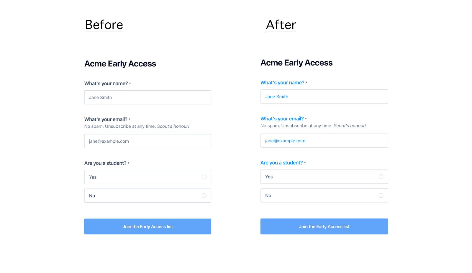
- Changing Copy Color for All Fields
Use Case: Change the text color for labels and input placeholders in all form fields.
This customization is particularly useful when you want to make sure that form text, including labels and placeholders, is easily readable against your chosen background colors.
Example:
.block-name label, .block-email label, .block-select-one label,
.block-name input::placeholder, .block-email input::placeholder {
color: #0096FF;
}
How the form looks after applying the CSS:
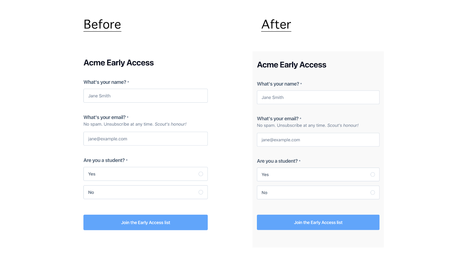
Changing Form Background
Use Case: Change the background color of the entire form.
Applying a custom background color helps to visually separate the form from the rest of the page content, drawing attention to it and improving the overall user experience.
Example:
.form-container {
background-color: #f9f9f9;
}
How the form looks after applying the CSS:
- Displaying Two Fields on the Same Row
Use Case: Display the first name and last name fields side by side in the form.
By positioning fields side by side, you can create a more organized and user-friendly layout, which can help users fill out the form more quickly and efficiently.
Example:
.block-name {
display: inline-block;
width: calc(50% - 0.56rem);
}
.block-name:nth-child(3) {
margin-left: 1rem;
}
How the form looks after applying the CSS:

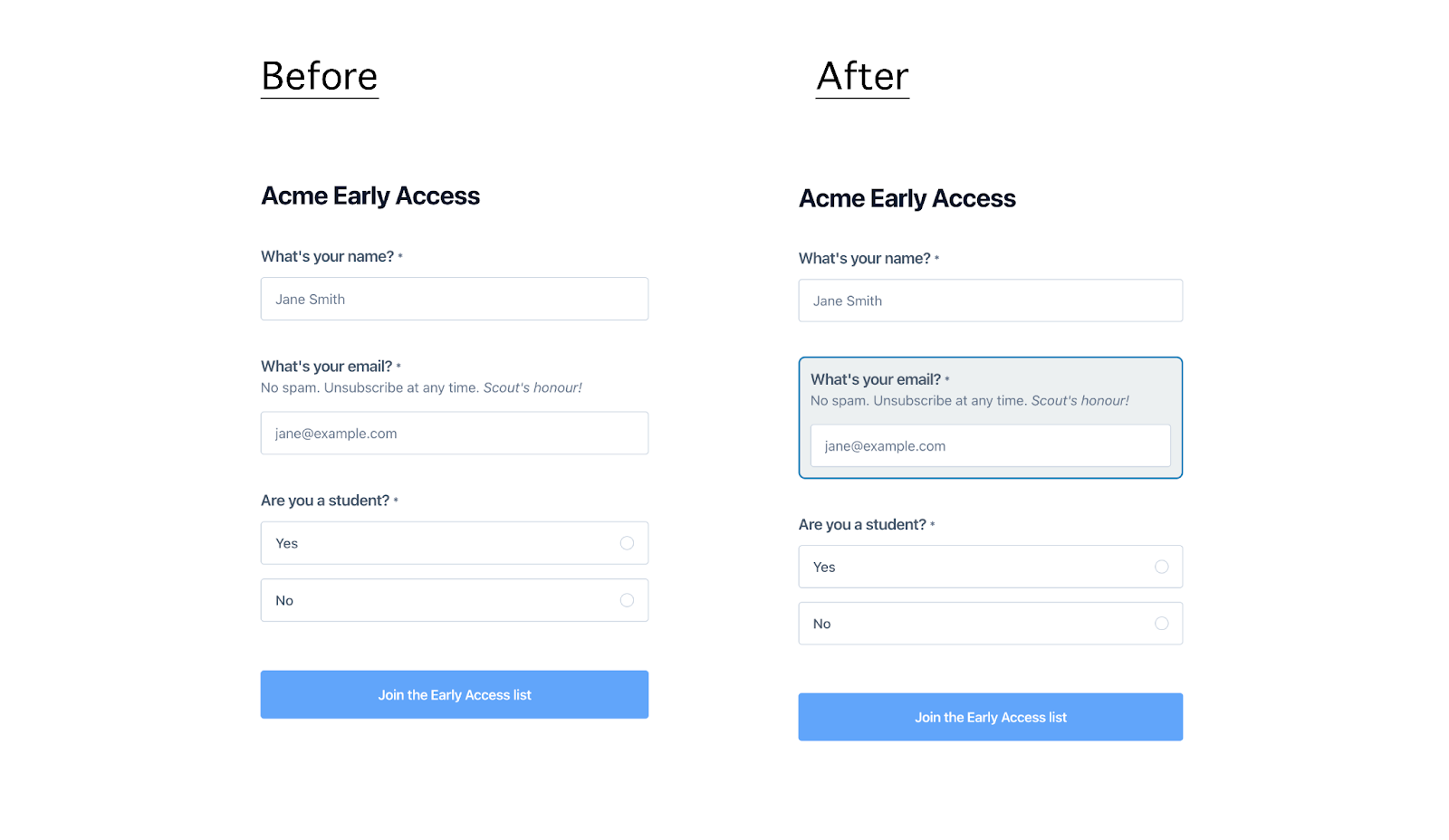
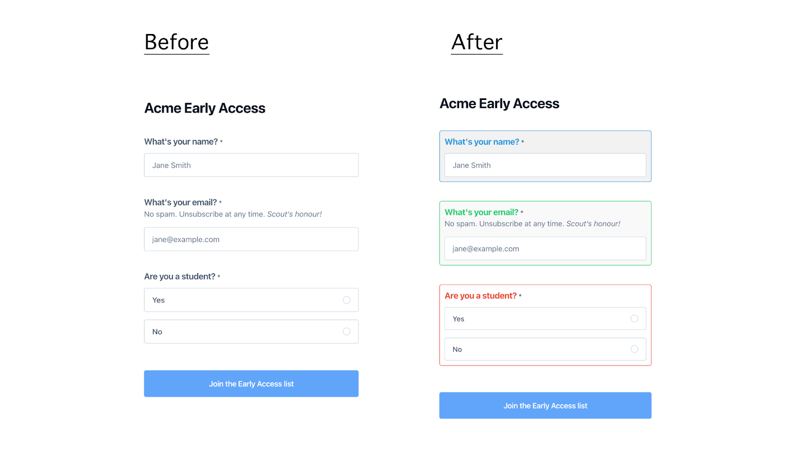
- Styling Еmail Field Based On Validation State
Use Case: Style the email input field to provide visual feedback for valid and invalid email entries.
Visual feedback is crucial for user interaction, as it guides the user in real-time, enhancing the overall form experience by making it clear when an email address is correctly formatted or needs correction.
Example:
.block-email input[type="email"]:valid:focus,
.block-email input[type="email"]:valid:not(:placeholder-shown) {
border-color: #2ecc71;
background-color: #eafaf1;
}
.block-email input[type="email"]:invalid:focus,
.block-email input[type="email"]:invalid:not(:placeholder-shown) {
border-color: #e74c3c;
background-color: #fdecea;
}
- Customizing a Single Element
Use Case: Customize the appearance of a single form element (e.g., email field).
Example:
.block-email {
padding: 12px;
border: 2px solid #2980b9;
border-radius: 8px;
font-size: 16px;
background-color: #ecf0f1;
}
How the form looks after applying the CSS:
- Customizing Several Elements
Use Case: Customize the appearance of several form elements (e.g., name, email, and single-select fields).
Example:
/* Customize the name field */
.block-name {
padding: 10px;
border: 1px solid #3498db;
border-radius: 5px;
background-color: #f2f2f2;
font-size: 15px;
}
.block-name label {
font-weight: bold;
color: #3498db;
}

/* Customize the email field */
.block-email {
padding: 10px;
border: 1px solid #2ecc71;
border-radius: 5px;
background-color: #f9f9f9;
font-size: 15px;
}
.block-email::placeholder {
color: #95a5a6;
font-style: italic;
}
.block-email label {
font-weight: bold;
color: #2ecc71;
}

/* Customize the single-select field */
.block-select-one {
padding: 10px;
border: 1px solid #e74c3c;
border-radius: 5px;
background-color: #ffffff;
font-size: 15px;
}
.block-select-one select {
width: 100%;
padding: 8px;
border: none;
border-radius: 5px;
background-color: #ecf0f1;
}
.block-select-one label {
font-weight: bold;
color: #e74c3c;
}
.block-select-one select:focus {
border: 1px solid #e74c3c;
outline: none;
}
How the form looks after applying the CSS:
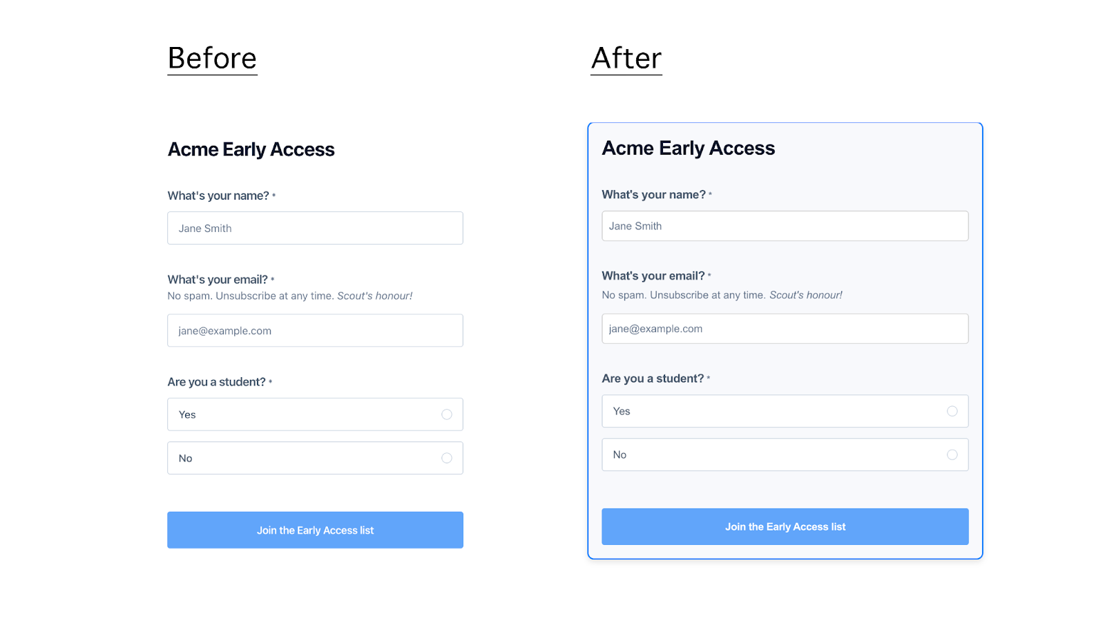
- Customizing the Whole Form
Use Case: Apply a uniform style to the entire form, including borders, background color, font, and shadows.
Example:
/* Customize the entire form */
.form-container {
border: 2px solid #007bff;
background-color: #f7f9fc;
padding: 20px;
border-radius: 10px;
box-shadow: 0 4px 8px rgba(0, 0, 0, 0.1);
font-family: 'Arial', sans-serif;
max-width: 600px;
margin: 0 auto;
}

/* Customize the name field */
.block-name {
margin-bottom: 15px;
}
.block-name input {
padding: 10px;
border: 1px solid #ccc;
border-radius: 5px;
width: 100%;
box-sizing: border-box;
}
.block-name label {
font-weight: bold;
margin-bottom: 5px;
display: block;
}

/* Customize the email field */
.block-email {
margin-bottom: 15px;
}
.block-email input {
padding: 10px;
border: 1px solid #ccc;
border-radius: 5px;
width: 100%;
box-sizing: border-box;
}
.block-email label {
font-weight: bold;
margin-bottom: 5px;
display: block;
}
.block-email::placeholder {
color: #999;
font-style: italic;
}

/* Customize the single-select field */
.block-select-one {
margin-bottom: 15px;
}
.block-select-one select {
padding: 10px;
border: 1px solid #ccc;
border-radius: 5px;
width: 100%;
box-sizing: border-box;
}
.block-select-one label {
font-weight: bold;
margin-bottom: 5px;
display: block;
}
.block-select-one select:focus {
border-color: #007bff;
outline: none;
}
How the form looks after applying the CSS:
Click here to see the form in action.
Best Practices and Final Tips
- Cross-Browser Compatibility: Always test your customized forms across different browsers to ensure they render correctly and consistently. Different browsers may interpret CSS slightly differently, so testing is crucial to avoid unexpected issues.
- Accessibility: Make sure your customizations do not negatively impact accessibility. For example, ensure sufficient color contrast for text and interactive elements, and use clear, readable fonts.
- Performance Considerations: Keep your CSS lean and efficient to avoid slowing down form load times. Overly complex or redundant CSS can negatively impact performance, especially on mobile devices.
- User Feedback: Use CSS to enhance user feedback, such as changing the appearance of fields when they are focused or when validation errors occur. This real-time feedback can greatly improve the user experience.
By leveraging these customization options, you can create forms that align perfectly with your brand identity and user experience goals. Feel empowered to experiment further with CSS properties to achieve the exact design you envision for your forms.
If you're experiencing issues or have questions, please contact us at [email protected]. We're here to assist you!
List of block type selectors:
If you want to target specific block types you can use the following selectors:
/* Heading 1 blocks */
.block-heading-1 {}

/* Heading 2 blocks */
.block-heading-2 {}

/* Text blocks */
.block-rich-text {}

/* Image blocks */
.block-image {}

/* Embed blocks */
.block-embed {}


/* Name blocks */
.block-name {}

/* Email blocks */
.block-email {}

/* Phone blocks */
.block-phone {}

/* URL blocks */
.block-url {}

/* Short text blocks */
.block-short-text {}

/* Long text blocks */
.block-long-text {}


/* Number blocks */
.block-number {}

/* Currency blocks */
.block-currency {}

/* Percent blocks */
.block-percent {}


/* Checkbox blocks */
.block-checkbox {}

/* Dropdown blocks */
.block-dropdown {}

/* Select one blocks */
.block-select-one {}

/* Select multiple blocks */
.block-select-multiple {}

/* Scale (0-10) blocks */
.block-scale {}


/* Hidden blocks */
.block-hidden {}

/* File upload blocks */
.block-file-upload {}