Blocks: Form Fields And Their Purpose
Form blocks on our platform are versatile elements that support data collection, enhance presentation, and improve user experience. Each block type has distinct capabilities and customization options tailored to specific form-building needs. This guide outlines each block’s purpose and usage best practices.
Note: Some blocks are available only on the Pro plan. These are clearly labeled throughout the article.
Text Input Blocks
These fields are for collecting user-entered text. Each input block can be customized by modifying the heading, adding a placeholder, and marking it as required.
Name Block
The name block is essential for collecting visitor names, aiding in personalizing communications and ensuring accurate user data.

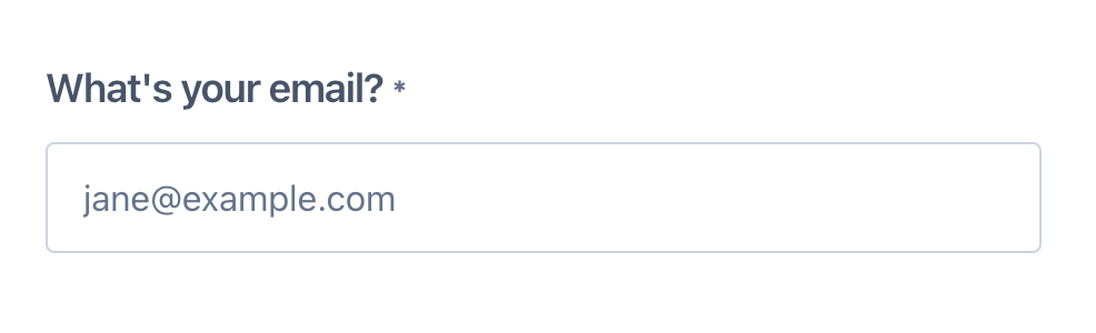
Email Block
The email block gathers email addresses, which is crucial for follow-up communications, newsletters, and account verifications. This block ensures email accuracy by validating formats and can optionally block free email providers.
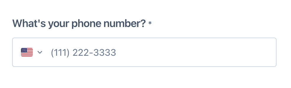
Phone Block
The phone block is used to collect phone numbers. It validates phone numbers and offers an option to include a country flag that automatically adds the appropriate country code, enhancing the accuracy of collected phone numbers. The "Allow all countries" option enables this feature for international phone numbers.
URL Block
The URL block is designed for collecting website addresses. It automatically adds "https://" if the user forgets to include it, ensuring all URLs are correctly formatted.

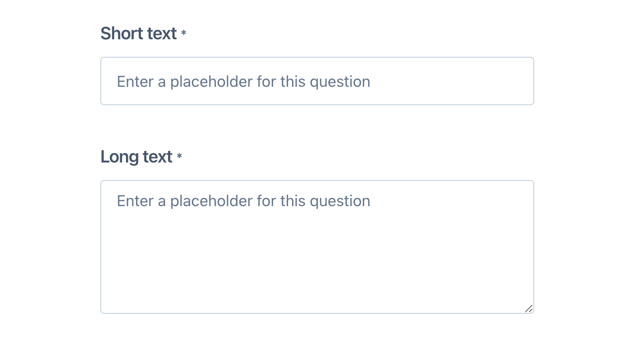
Short Text and Long Text Blocks
- Short Text Block: Ideal for brief responses.
- Long Text Block: Suitable for detailed answers, allowing multiple lines of text.
Hidden Block
Using hidden blocks allows for seamless data integration and improved user experience by automatically filling in information that users would otherwise need to provide manually. This functionality is beneficial for various purposes, including collecting UTMs for marketing analytics and enriching data through pre-filled fields.
Key Features:
- Fields can be prepopulated using URL query parameters, either by the field name or ID.
- Automated URL Generation: Enter the desired value for the hidden field on the "Share" page, and the URL will automatically update to include the field name and value.
How to Use:
- Add a Hidden Block from the form builder dropdown.
- Name your hidden field by clicking inside the "Enter a column name" field.
- On the "Share" page, find your hidden field and enter the prepopulation value. The URL under "Copy link" will update automatically.
This block simplifies data management and enhances the functionality of your forms by allowing seamless integration of hidden parameters.

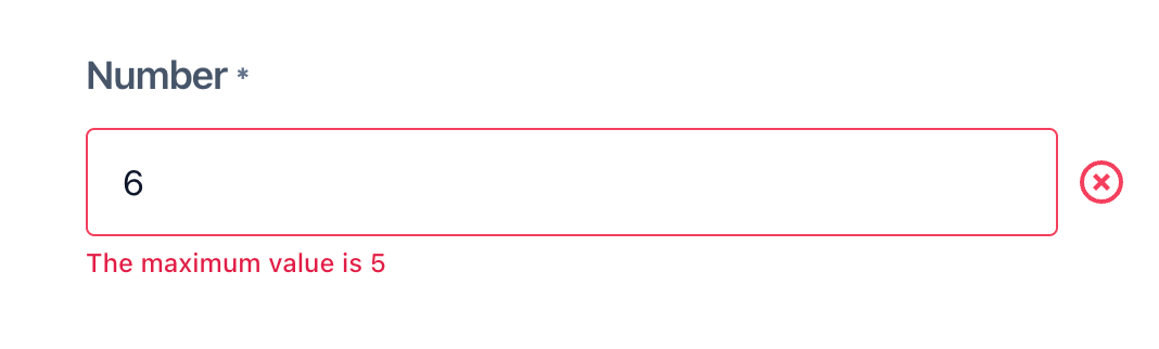
Number Input Blocks
The number block is tailored for numerical inputs and is useful for collecting data such as quantities, ages, or ratings. You can set minimum and maximum values to control the range of acceptable answers.
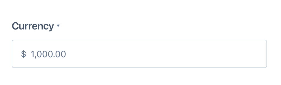
Currency Block
The currency block is used for financial information, allowing you to set min-max values and choose the currency symbol (e.g., USD, CAD, GBP, EUR).
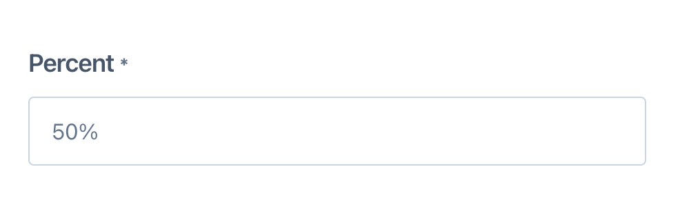
Percent Block
The percent block collects percentage-based inputs, automatically adding a "%" sign and allowing you to set minimum and maximum values.
Select Input Blocks
These blocks allow users to make one or more choices from a set of options.
Checkbox Block
A single checkbox, useful for yes/no questions or confirming agreements.

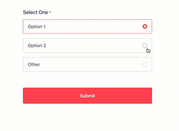
Select One Block
The select one block allows users to choose a single option from multiple choices, useful for exclusive choice questions. There are now three types of select blocks.
If a page has one 'select one' block and no other blocks, then when a user selects their answer, this will automatically move the user to the next page.

Radio Button Block
Users select one option from a vertical list of choices. You have the option to add an open-ended 'Other' choice from the block settings.
Dropdown Block
Presents a list of options in a dropdown menu, ideal for questions with a predefined set of answers. Add options by typing each one on a new line. This block type is perfect for questions that have more than 3-4 possible answers.
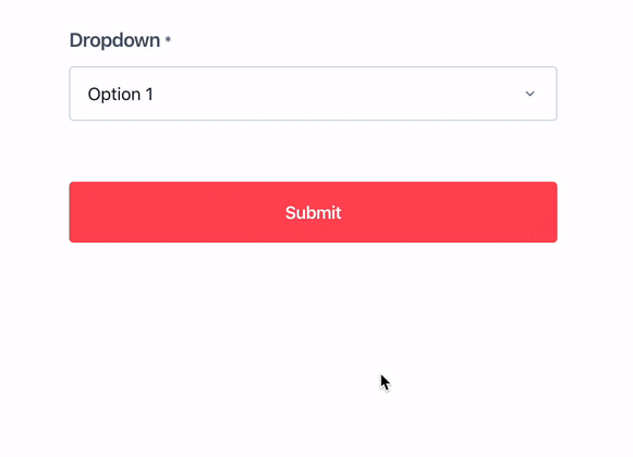
Image Select Block
This innovative block type allows users to select from visually appealing image-based options. Ideal for questions requiring visual context, such as product selections, design preferences, or choosing from multiple styles.

- Responsive Design: Adapts seamlessly to various screen sizes, ensuring usability across devices.
- Alternative Text: Add descriptive text for each image to improve accessibility.
- Hide Labels: if you don't want to have any text below the images, you can select "hide labels"

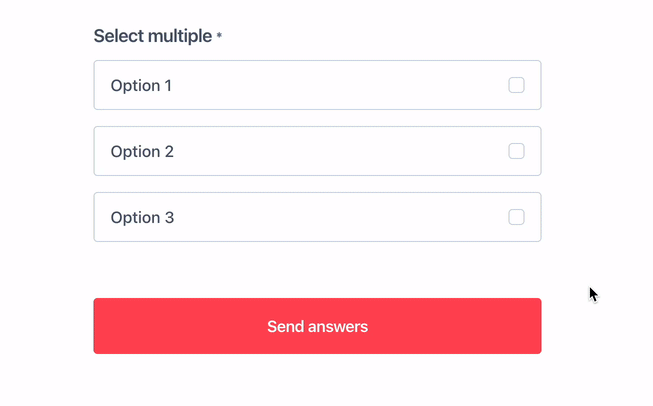
Select Multiple Block
The select multiple block lets users choose more than one option from a list, ideal for questions where multiple selections are valid.
Scale Block
The scale block is used to collect ratings or opinions on a numerical scale, allowing you to adjust the range and label the start, middle, and end points for clarity.

Content Blocks
These blocks structure and add context to your forms with headings, descriptions, and images.
Heading 1 / Heading 2
- Heading 1: For section titles.
- Heading 2: For subheadings.
Text Block
Rich text editor for instructions, bullet lists, or links.

Image Block
Displays static images to enhance visual context or branding.

Pro Plan Blocks
These advanced blocks are only available to Pro plan users and support richer integrations and uploads.
Basic Embed Block (Pro)
Embed rich media such as calendars, videos, or other content that supports oEmbed. Just paste a supported URL (e.g., YouTube, Google Calendar, Figma) and the media will appear inline within your form.

Calendly Embed Block (Pro)
Embed a Calendly scheduler so users can book meetings without leaving the form. This will pass the form user's name and email address into the Calendly form.

HubSpot Calendar Embed Block (Pro)
Add your HubSpot meeting calendar directly into the form to streamline scheduling. This will pass the form user's name and email address into the HubSpot form.

File Upload Block (Pro)
The file upload block allows users to upload files directly through the form, ideal for applications, submissions, or any form requiring file attachments.

You can find more information about embedding options, particularly how to embed a calendar, on this page.
By understanding and effectively utilizing these form blocks, you can create more dynamic, user-friendly forms tailored to your specific data collection needs. If you're experiencing issues or have questions, please contact us at [email protected]. We're here to assist you!